Showing posts with label link_popurri. Show all posts
Showing posts with label link_popurri. Show all posts
Friday, August 21, 2009
Friday, July 24, 2009
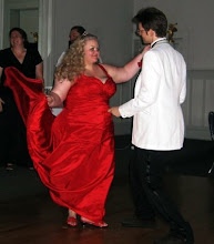
It's your birthday!
Something about today's XKCD made me smile big and wide, and I found it oddly life-affirming. I'd been having kind of a crappy night, and this cheered me up to no end.
We all need a friend like that, and I think it turns out I have a few. Thanks, y'all - you know who you are.
We all need a friend like that, and I think it turns out I have a few. Thanks, y'all - you know who you are.
Thursday, July 23, 2009
Wolfram Alpha: good idea, terrible interface
"The market of stupid people is indeed enormous. The market of stupid people who like to use data-visualization tools is, well, not."
Unqualified Reservations digs into why Wolfram Alpha works so badly.
Unqualified Reservations digs into why Wolfram Alpha works so badly.
"You've got to come back with me, Marty!"
So, the first scene in Back to the Future 2 is also the last scene in Back to the Future 1. But, since Michael J Fox was visibly older and Marty's girlfriend had been recast, they had to reshoot the scene for the opening of 2. (This should not be an exciting trivia fact to anyone.)
However, proving once again that no matter what, someone has more free time than you do, The Internet has made a side-by-side comparison of the two versions of the same scene.
Funny stuff to note: while Michael J Fox delivers his lines in a very different way, Christopher Lloyd is almost perfectly synced with himself. Also, the number of reused shots surprised me - for example, the close-up of Doc Brown pulling stuff out of the trash is recycled from the first version, but the shot of Doc dumping it all into Mr. Fusion is new - which means that some poor sod had to carefully watch the first version and figure out what pile of trash props they needed for the reshoot. (Why do that? How is that easier than just using new trash?)
Monday, July 20, 2009
Apollo + 40
For the 40th Anniversary of the Moon Landing, NASA has restored some of the original TV footage. BB, as always, has the original.
Still stunning, 4 decades later.
Also, there's something fundamentally eerie about the way we seem to have abandoned the future 40 years in the past.
Still stunning, 4 decades later.
Also, there's something fundamentally eerie about the way we seem to have abandoned the future 40 years in the past.
Monday, July 6, 2009
In this post, there is a Rapping Opera Singer
Guys this is what the internet is for: some guys have used Science to make the Worst Song Ever. By their calculations, "fewer than 200 individuals of the world's total population would enjoy this piece." Go Listen.
Thursday, June 25, 2009
SONICS!
Somebody put together a youTube movie of every single use of the Sonic Screwdriver.
Also, mad bonus points for the musical selection.
Also, mad bonus points for the musical selection.
Volcanoes are Awesome

Recap: astronauts on the space station have taken a picture of an exploding volcano from orbit. My 10 year old self is FREAKING OUT.
(Via BoingBoing and NASA)
Tuesday, June 16, 2009
The Beatles: Rock Band.
Alert readers of this space will have noted that we're both fans of Rock Band and The Beatles. So, Harmonix's new game is less a potential purchase as much as it is a lifestyle fine.
In case you missed it, check out the promo movies over at the official site. The opening cinematic is definitely the one to watch. To quote my Mother, "It's like they were actually THERE."
Thursday, June 11, 2009
Once again, YouTube brings the funny
It's a regular topic of horrified conversation in Doctor Who fan circles: what would the show look like in american hands (besides that mid-90s TV movie we don't talk about.)
As usual, YouTube has the answer:
Doctor Who opening in the styles of both Dallas and Arron Spelling.
This post inspired by the rumor that for next season, new show-runner Stephen Moffat is going to be replacing the existing opening credits with one that has a classic show style "face in space". As long as they get rid of that awful remix of the theme with something better, they can do whatever they want as far as I'm concerned.
(There's actually a very easy test to tell if a version of the Doctor Who theme is good or not: if you can identify a single instrument being used, they screwed up.)
Also, to wash that down with, check out Star Trek as the A-Team (whomever made that gets a FONTS WEEK thumbs up for the font in the title there.)
Friday, June 5, 2009
Human Languages: Not Type Safe
My new favorite programming blog, secrectGeek, has an excellent article about how the better you are at programming, the worse you are at talking to people.
The executive summary: programming languages reward terse clarity, something that human languages do not reward in any way.
Here's the bit I think is funny: everybody except programmers already knows all this. This is why job requirements for programming positions always list "good communication skills" as a requirement. Pretty much everywhere else that's assumed. With programmers you have to list it as a seperate job requirement.
Thursday, June 4, 2009
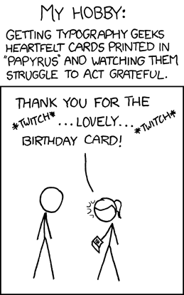
It's a FONTS WEEK BONUS
After fonts week closed down, XKCD just happened to come out with a perfect postscript:
(and the requisite wiki link)
(and the requisite wiki link)
Wednesday, June 3, 2009
As long as we're talking about Adventure Games...
LucasArts has a new Indiana Jones action game coming out for the Wii: Indiana Jones and the Staff of Kings. That's not real big news, in-and-of itself. What is interesting is that apparently the classic SCUMM game Indiana Jones and the Fate of Atlantis will be included as an unlockable bonus feature.
Hmmmmm.
So, LucasArts now has a SCUMM interpreter that natively runs on Wii hardware. (There's no word, as yet, as to whether ScummVM's code got used for any of this.) That seems like an awful lot of work for a single bonus feature.
On the other hand, as proof of concept piece as a prelude to releasing their old SCUMM games on the Wii's Virtual Console, that DOES seem worth the effort...
Tuesday, June 2, 2009
Look behind you! A Three-Headed Monkey!
Well, the unthinkable has happened: they're actually making a new Monkey Island game.
It's okay, I'll wait for you to glue your brain back together again just in time for me to BLOW IT APART: Tales of Monkey Island is being made by Telltale games, the dudes that made, among other things, the new Sam n' Max and the Strongbad Games. ALSO: they were the group of people who used to be the Adventure Game unit back at LucasArts in the old days when LucasArts made really good games, not highly questionable Star Wars shooters.
For example: the lead guy on the new Monkey Island is Dave Grossman, who was one-third of the team on the original Secret of Monkey Island along with Ron Gilbert and Tim Schafer, not to mention the co-designer of Day of the Tentacle. And, they've brought a whole stack of the old team along as well, including Michael Land (the guy who wrote the music for the Monkey Island games and just about every other LucasArts game) and Dominic Armato (who played Guybrush in Monkey Island 3 & 4).
But wait, why stop there? At the same time, LucasArts is also releasing a remake of the original Secrect of Monkey Island, all tricked out for modern systems - but with the ability to switch back and forth to the old version.
Before you ask, Ron Gilbert has some awesome things to say about the situation.
Towards the end, he makes an excellent point. By the end of the year, he, Dave Grossman, and Tim Schafer will all have new games out. IS THIS THE END OF THE WORLD?
Its the end of the world for SUCKY GAMES, I can tell you that.
Saturday, May 30, 2009
Wednesday, May 27, 2009
Wikipedia finally does a mobile verison
Via this article on /., it turns out Wikipedia has finally cooked out a version of the site optimized for mobile devices (ie, my iPhone). Looking forward to seeing if I can ditch all those 3rd party apps I keep using to get to wikipedia faster.
Saturday, May 23, 2009
Microsoft's ClearType Fonts
FONTS WEEK!
Microsoft is not a company to let an expensive-to-develop technology go to waste. While ClearType was present but optional in Windows XP, it's fully active in Vista - and running inside of both Internet Explorer 7 and Office 2007 regardless of the rest of the operating system.
With this in mind, Microsoft did what any self-respecting pesudo-monoploy would do: it was time for some new fonts! And like that, the ClearType Font Collection was born. The idea was simple, and in many ways, genius - with ClearType now fully integrated into the OS' text display system, develop a new set of system fonts that take full advantage of the technology to look as good as possible on both the screen and the page.
This is the sort of behavior that earned Microsoft its reputation for evil ("What, they even want us to upgrade our fonts?") but in this case they didn't get all that much flack since the new fonts are gorgeous. And, in a moment of sanity, the whole batch of fonts come free with both the Powerpoint 2007 Viewer and the Office 2007 Compatability Pack. I don't intend to be playing any Powerpoint slide decks on my machine any time soon, but the viewer has become one of the first things I install on a new machine to get those nifty fonts.
I've nicknamed them the "C-type" fonts, since they cleverly all start with the letter "C":
Calibri
Cambria
Candara
Consolas
Constantia
Corbel
(If you have them installed, those links should be using the fonts in question. If not, wiki has examples for you.)
At the same time, Calibri became the new default font in Office, replacing Times New Roman in Word and Arial in everything else. Finally we're going to get a break from TNR being the font everyone uses for everything.
As far as the rest of the bath goes, I couldn't be happier. Consolas might be the best looking mono-spaced font I've ever seen, and I think Candara is just gorgeous - If I was in college still, I'm pretty sure Candara would become my standard essay font. As for the rest? To my (mostly untrained) eye, Constantia is a better Times New Roman /Georgia, and Corbel is a better Arial / Verdana. Calibri is just sharp - possibly the perfect default font. I'm not really sure where Cambria fits in, but it's apparently designed for displaying mathematical text as it includes all manner of extra fancy math symbols. (Possibly, this is Microsoft's first step towards going after TeX with Word.)
Friday, May 22, 2009
Oh, SNAP.
"It’s terrible. Biblically terrible. Possibly the worst new car money can buy. It’s the first car I’ve ever considered crashing into a tree, on purpose, so I didn’t have to drive it any more. "There's a special kind of "British Rude" that I'm a big fan of, mostly due to my misspent youth watching Monty Python. With that in mind, I immensely enjoyed Jeremy Clarkson's review of the new Honda Insight in The Times.
ClearType, or: Welcome to the State of the Art for the Year 2000
FONTS WEEK!
The moral of Fonts Week, if there is one, is that typography is really, really complicated.
For example, which do you optimize for: reading on the screen or reading on paper? Traditionally, of course, there was no contest - fonts needed to look good on paper, and nothing else. Even when computers started displaying real fonts on the screen in the late 80s, the focus was still on the page - so the mark of a "good" font display was how closely the text on the screen matched the way it was going to look on the page.
Take Times New Roman, for instance. TNR, that stock font for college essays everywhere, was originally commissioned by the British newspaper The Times in 1931, and was their standard text font from then through the early 70s. While The Times itself doesn't use the font any longer, it's become a standard baseline for pretty much any print that needs to look good.
The problem is that it just doesn't look all that great on the screen. The issue is one of resolution - TNR (and most other fonts) are intended to look good at print resolution - 300 or 600 dpi. Computer displays top out, generally speaking, at about 96 dpi, which means that in a best case scenario you're seeing about 1/3 of the information in any given TNR letter.
A brief review, at this point, how computer displays work. A computer screen has a finine number of pixels arranged in a grid - each of which can be a single color at any given time. Since each pixel is a square, this is what gives computer displays that slightly blocky look - your standard XGA screen is 1024 pixels wide by 768 pixels tall, which really isn't all that many. If you imagine the screen as a sheet of graph paper where you have to fill in a selection of squares to make an image, it's easy to see how you end up with jagged edges, since each block can be either on or off. The more pixels and the more colors you have reduce the problem, but this is still a fundamental aspect of how computers display images.
The first batch of technology to reduce this effect was anti-aliasing. Simply put, after something is drawn into the pixel grid, AA does additional passes to draw in fainter pixels around the jagged edges, making the image appear smoother.
The problem gets exacerbated with text, since text is teensy. Anti-aliasing needs a fair amount of space to work freely, and a single letter of text on the screen just doesn't have all that many pixlels. For example, depending on your settings, the letter i is probably only a pixel or two wide. As 2x2 pixels, there aren't a lot of ways to make the dot over the i look like anything but a tiny square.
One of the approaches was to build new fonts. As part of their Core Fonts for the Web, Microsoft introduced two new typefaces: Georgia and Verdana, which were intended to be replacements for Times New Roman and Arial, respectively, but optimized for viewing on the screen, and therefore cared more about how they parsed into the pixel grid then how they looked on the page. This is why the two of them are very easy to read, but are also tremendously boring to look at when printed out. Assuming you have all the right fonts installed, Georgia and Verdana should be a little clearer to read:
Then, when LCD screens came along, suddenly a cool new option presented itself: subpixel rendering. LCD screen don't work quite like the older CRT tubes - on an LCD, each pixel is actually three segments, one each for red, green, and blue. Witty programmers suddenly thought - hey, we can effectively get a times three increase in resolution for our anti-aliasing routines as long as we don't care all that much about what color the pixels around the edge are. The good news is that at the tiny sizes we're talking about, color really doesn't matter - the human eye just isn't that good. So, if taking a black letter and adding a red-black edge to it makes it look smoother, the eye just blends the colors together but still sees the shape.
As usual, this is the point where Microsoft and Apple started moving in totally different directions. Apple wrote their whole subpixel engine around making the fonts on the screen look as much like the designer wanted them to look as possible. Microsoft went the other way, and used their tech to jam the font characters into the pixel grid, fidelity to the designer be damned. Therefore, we end up with a world where Microsoft systems are easier to read on the screen but look different when printed out, and Apple systems look the same on the screen as on the page, at the cost of some readability on the screen. Joel "Joel On Software" Spolsky has an excellent article comparing the two approaches, complete with some Apple vs. MS graphics.
However, there's an extra wrinkle. Microsoft named their subpixel technology "ClearType" when they launched it in 2000 as part of the Microsoft Reader ebook platform. It later made it's way in to the OS itself as of Windows XP. However, while it's fully operational in Vista out of the box, it's turned off by default in Windows XP, despite being fully present. I just found this out myself, I had always assumed that ClearType was turned on and just didn't look very good on my XP machine. So here, if you're running XP on an LCD screen, try this experiment:
If you're anything like me, you've got a windows desktop full of icons. Crack open a Windows Explorer or My Computer window such that you have some text in that window and can still see the icon labels on the desktop. Right click on the desktop and choose properties. Go to Appearance, then click on Effects. In the resulting dialog box, there should be a pull-down menu under "Use the following method to smooth the edges of screen fonts". The selected option is probably "Standard". Change that to ClearType. Hit Okay until you're out of all the dialog boxes.
How much better does the screen look now? On my two machines the difference was pretty incredible. Turns out that feature has been in XP since day one, and I only just discovered it this week, eight years later. Dang.
But wait, there's more! Since ClearType is really just using a function of the way LCD screens work to do an elaborate optical illusion, there's a whole lot of ways to make it look BAD. With that in mind, Microsoft Typography released the ClearType Tuner PowerToy, which adds a bunch of ways to dial your ClearType settings in to your specific monitor. Check it out. Personally, I'm sold.
The moral of Fonts Week, if there is one, is that typography is really, really complicated.
For example, which do you optimize for: reading on the screen or reading on paper? Traditionally, of course, there was no contest - fonts needed to look good on paper, and nothing else. Even when computers started displaying real fonts on the screen in the late 80s, the focus was still on the page - so the mark of a "good" font display was how closely the text on the screen matched the way it was going to look on the page.
Take Times New Roman, for instance. TNR, that stock font for college essays everywhere, was originally commissioned by the British newspaper The Times in 1931, and was their standard text font from then through the early 70s. While The Times itself doesn't use the font any longer, it's become a standard baseline for pretty much any print that needs to look good.
The problem is that it just doesn't look all that great on the screen. The issue is one of resolution - TNR (and most other fonts) are intended to look good at print resolution - 300 or 600 dpi. Computer displays top out, generally speaking, at about 96 dpi, which means that in a best case scenario you're seeing about 1/3 of the information in any given TNR letter.
A brief review, at this point, how computer displays work. A computer screen has a finine number of pixels arranged in a grid - each of which can be a single color at any given time. Since each pixel is a square, this is what gives computer displays that slightly blocky look - your standard XGA screen is 1024 pixels wide by 768 pixels tall, which really isn't all that many. If you imagine the screen as a sheet of graph paper where you have to fill in a selection of squares to make an image, it's easy to see how you end up with jagged edges, since each block can be either on or off. The more pixels and the more colors you have reduce the problem, but this is still a fundamental aspect of how computers display images.
The first batch of technology to reduce this effect was anti-aliasing. Simply put, after something is drawn into the pixel grid, AA does additional passes to draw in fainter pixels around the jagged edges, making the image appear smoother.
The problem gets exacerbated with text, since text is teensy. Anti-aliasing needs a fair amount of space to work freely, and a single letter of text on the screen just doesn't have all that many pixlels. For example, depending on your settings, the letter i is probably only a pixel or two wide. As 2x2 pixels, there aren't a lot of ways to make the dot over the i look like anything but a tiny square.
One of the approaches was to build new fonts. As part of their Core Fonts for the Web, Microsoft introduced two new typefaces: Georgia and Verdana, which were intended to be replacements for Times New Roman and Arial, respectively, but optimized for viewing on the screen, and therefore cared more about how they parsed into the pixel grid then how they looked on the page. This is why the two of them are very easy to read, but are also tremendously boring to look at when printed out. Assuming you have all the right fonts installed, Georgia and Verdana should be a little clearer to read:
- This (should be) in Arial
- This (should be) in Verdana
- This (should be) in Times New Roman
- This (should be) in Georgia
Then, when LCD screens came along, suddenly a cool new option presented itself: subpixel rendering. LCD screen don't work quite like the older CRT tubes - on an LCD, each pixel is actually three segments, one each for red, green, and blue. Witty programmers suddenly thought - hey, we can effectively get a times three increase in resolution for our anti-aliasing routines as long as we don't care all that much about what color the pixels around the edge are. The good news is that at the tiny sizes we're talking about, color really doesn't matter - the human eye just isn't that good. So, if taking a black letter and adding a red-black edge to it makes it look smoother, the eye just blends the colors together but still sees the shape.
As usual, this is the point where Microsoft and Apple started moving in totally different directions. Apple wrote their whole subpixel engine around making the fonts on the screen look as much like the designer wanted them to look as possible. Microsoft went the other way, and used their tech to jam the font characters into the pixel grid, fidelity to the designer be damned. Therefore, we end up with a world where Microsoft systems are easier to read on the screen but look different when printed out, and Apple systems look the same on the screen as on the page, at the cost of some readability on the screen. Joel "Joel On Software" Spolsky has an excellent article comparing the two approaches, complete with some Apple vs. MS graphics.
However, there's an extra wrinkle. Microsoft named their subpixel technology "ClearType" when they launched it in 2000 as part of the Microsoft Reader ebook platform. It later made it's way in to the OS itself as of Windows XP. However, while it's fully operational in Vista out of the box, it's turned off by default in Windows XP, despite being fully present. I just found this out myself, I had always assumed that ClearType was turned on and just didn't look very good on my XP machine. So here, if you're running XP on an LCD screen, try this experiment:
If you're anything like me, you've got a windows desktop full of icons. Crack open a Windows Explorer or My Computer window such that you have some text in that window and can still see the icon labels on the desktop. Right click on the desktop and choose properties. Go to Appearance, then click on Effects. In the resulting dialog box, there should be a pull-down menu under "Use the following method to smooth the edges of screen fonts". The selected option is probably "Standard". Change that to ClearType. Hit Okay until you're out of all the dialog boxes.
How much better does the screen look now? On my two machines the difference was pretty incredible. Turns out that feature has been in XP since day one, and I only just discovered it this week, eight years later. Dang.
But wait, there's more! Since ClearType is really just using a function of the way LCD screens work to do an elaborate optical illusion, there's a whole lot of ways to make it look BAD. With that in mind, Microsoft Typography released the ClearType Tuner PowerToy, which adds a bunch of ways to dial your ClearType settings in to your specific monitor. Check it out. Personally, I'm sold.
Subscribe to:
Posts (Atom)