Friday, December 11, 2009

The Final Countdown!


20 DAYS YA'LL!!!

Our lil daughter is on her way :)

Monday, November 30, 2009

36 Weeks Ya'll

Four weeks to go! Isabelle is super kicky and I think she is rearing to pop outside. I am officially uncomfortable, so I am excited about her coming out to play as well.

Thursday, November 12, 2009

HOLY CARP, 33 WEEKS!


Lil Iz is going to be here next month. AMAZING!

Sunday, October 25, 2009

Stay on Target!

T-Minus 9 Weeks as of today.

Thursday, October 22, 2009

OUR LIL PUMPKIN!


So amazed I have just 10 weeks to go!
(sing "The Final Countdown" here :D)

Tuesday, September 22, 2009

2 Pounds and Over a Foot Long!


No, that is not a headline for an ad about a Tacos de Alcopoco Burrito (see Monday, June 8, 2009), it's our baby! Our little bun in the oven is not so little anymore!

FOA: August 19, 2009 to ???


Say hello to the new Fortress of Awesome.

Saturday, September 19, 2009

FOA: April 20, 2007 to August 19, 2009


And THAT is how you do that.


Stand by for updates.

Tuesday, August 25, 2009

Guess what we did today!


THAT'S RIGHT! WE BOUGHT A HOUSE! Who you can't see flanking us is Paul and Nancy, they helped make this happen. THANKS GUYS, you are the kindest In-Laws ever!

PS> Gabe has the cutest smile here :)

Friday, August 21, 2009

Every 4th Thing

Thursday, August 13, 2009

NEW HELMAN HOUSE!


Say hello to the new Fortress of Awesome.

Wednesday, August 12, 2009

IT'S A GIRL!


After today's ultrasound, we know we are going to have a daughter this December! Say hello to Isabelle Lovell Helman :)

Newly added: Current Reading List

Because having a blog wasn't already narcissistic enough, I've added my "current reading" list to the sidebar, retroactive back to October.

Now you too can follow along and watch as I start and fail to finish books!

Tuesday, August 11, 2009

20 WEEKS: HALF WAY!


That is one sweet lil melon :)

Thursday, August 6, 2009

WEEK 19: Such is Mango!


Our sweetie baby is getting tropical this week, we'll be 5 months as of Sunday!!!

Sunday, August 2, 2009

And how was YOUR weekend?


YES, that IS a skull-shaped wasps nest on the back of that freaky doll's head.

We spent the weekend at my parent's old house packing up the remaining childhood stuff. This doll did not make the cut, we left her next to some rusty nails on the cutting block -- so now she is spooky mountain people's performance art.

We are going to frame this photo and try to sell it on Second Saturday.

Thursday, July 30, 2009

18 WEEKS: Our Lil Sweet Potato!


Super Exciting! 4.5 months is almost 1/2 way there :)

Friday, July 24, 2009

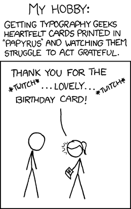
It's your birthday!

Something about today's XKCD made me smile big and wide, and I found it oddly life-affirming. I'd been having kind of a crappy night, and this cheered me up to no end.

We all need a friend like that, and I think it turns out I have a few. Thanks, y'all - you know who you are.

Thursday, July 23, 2009

Wolfram Alpha: good idea, terrible interface

"The market of stupid people is indeed enormous. The market of stupid people who like to use data-visualization tools is, well, not."

Unqualified Reservations digs into why Wolfram Alpha works so badly.

"You've got to come back with me, Marty!"

So, the first scene in Back to the Future 2 is also the last scene in Back to the Future 1. But, since Michael J Fox was visibly older and Marty's girlfriend had been recast, they had to reshoot the scene for the opening of 2. (This should not be an exciting trivia fact to anyone.)

However, proving once again that no matter what, someone has more free time than you do, The Internet has made a side-by-side comparison of the two versions of the same scene.

Funny stuff to note: while Michael J Fox delivers his lines in a very different way, Christopher Lloyd is almost perfectly synced with himself. Also, the number of reused shots surprised me - for example, the close-up of Doc Brown pulling stuff out of the trash is recycled from the first version, but the shot of Doc dumping it all into Mr. Fusion is new - which means that some poor sod had to carefully watch the first version and figure out what pile of trash props they needed for the reshoot. (Why do that? How is that easier than just using new trash?)

Monday, July 20, 2009

Apollo + 40

For the 40th Anniversary of the Moon Landing, NASA has restored some of the original TV footage. BB, as always, has the original.

Still stunning, 4 decades later.

Also, there's something fundamentally eerie about the way we seem to have abandoned the future 40 years in the past.

Monday, July 6, 2009

In this post, there is a Rapping Opera Singer

Guys this is what the internet is for: some guys have used Science to make the Worst Song Ever. By their calculations, "fewer than 200 individuals of the world's total population would enjoy this piece." Go Listen.

WEEK 15: Feeling like I'm pregnant


Up until now I just felt sick, but as of yesterday, something has changed. I went to take a nap and rolled onto my stomach and for the first time I felt like there was something there. I guess it is time for 5.25 months of side sleeping now :)

Thursday, July 2, 2009

Swine Flu is Scary, by Heidi Helman

So it turns out that Mother Nature's relative, Uncle Pestilence, has come up with a great thing to STRESS out pregnant ladies -- Swine Flu.

I consider myself a healthy gal; good pulse, great BP 108/67, high-ish but okay cholesterol, etc. I am a tad high on my prenatal screen for glucose tolerance, so I may be at risk for gestational diabetes, but that is temporary since it is based on placenta hormones and regularly I am not diabetic. I am a bit fluffier than I would like, but that is the way the it is and by all accounts I am a very healthy pregnant gal. Or am I?

According to the CDC: anyone who is overweight, pregnant, diabetic, asthmatic or suffers from heart problems is at risk to get the living tar kicked out of them by the Swine Flu. I can't help but notice that I can use three of those adjectives on myself. DAMN IT! So now I have these horrible fears of me and the baby catching the Swine Flu and keeling over from delivering in the middle of the winter flu season. I know this is a useless worry to dwell on because all I can do is take good care of myself, wash my hands often, avoid eating out as much, stop licking door knobs and hope for the best. No amount of worry will make me any safer from illness, if anything the stress of worry weakens the immune system.

I have had the flu once, I was a year out of college, and it was the worst I had ever felt in my entire life. I missed a whole week of work and I was living in a apartment by myself with my little dog Lexxy. I laid on the couch and moaned and little Lexxy laid on my chest and snuggled my cheek. After 3 days my fever of 103 broke and I began to want to stand upright again. By day 7 I was back at work.

Considering I pulled through that one flu within a week, I guess I should be comforted by the fact that my body knows how to kick some influenza tush. Maybe even if I do get Swine Flu, everything will turn out okay. I just have to make sure to keep taking good care of myself -- and not listen to the media.

Tuesday, June 30, 2009

Week 14: It would seem the symptoms weren't psychosomatic after all.


G: IT HAS A FACE!

H: And it looks like Gabe :)

G: Hi there, little guy. We don't know what you're favorite food is, or what you like to do for fun, or even what you're gender is, but we love you already. Welcome aboard.

Thursday, June 25, 2009

SONICS!

Somebody put together a youTube movie of every single use of the Sonic Screwdriver.

Also, mad bonus points for the musical selection.

Words to Live By

“A computer lets you make more mistakes faster than any invention in human history-with the possible exceptions of handguns and tequila.”

--Mitch Ratcliffe


(Sidebar: while typing this in, I tried to find the correct Mitch Ratcliffe to attribute the quote to; I assume this is the right guy, but I'm still a little shaky.)

Volcanoes are Awesome


Recap: astronauts on the space station have taken a picture of an exploding volcano from orbit. My 10 year old self is FREAKING OUT.

(Via BoingBoing and NASA)

Tuesday, June 23, 2009

Week 13: Hello Second Trimester! :)


This week, it is a bitty little peach :) ADORABLE! We find out more facts this Thursday with ultrasound photos, will post soon...

Tuesday, June 16, 2009

The Beatles: Rock Band.

Alert readers of this space will have noted that we're both fans of Rock Band and The Beatles. So, Harmonix's new game is less a potential purchase as much as it is a lifestyle fine.

In case you missed it, check out the promo movies over at the official site. The opening cinematic is definitely the one to watch. To quote my Mother, "It's like they were actually THERE."

Monday, June 15, 2009

Oh by the way...

In case you missed the subtext in the last post, it turns out we're having a baby.

PREGGO REPORT: 12 weeks and steady as she goes...


So I am 12 weeks and 1 day today! I feel relieved and not ill at the moment; great feelings I haven't experienced much in the past 12 weeks :)

The baby is 2+ inches long and the size of a plum. How adorable is that!? I love the websites that equate fetal size to fruit, too cute.

The statistics took an exciting shift in our favor over the weekend, for those of you who don't know, 12 weeks is a marker all preg women wait for. Chances of the baby taking off at this point are significantly lower and we have moved into the wonderful territory of "90% Chance of Awesomeness!"

Thanks for all the well wishes and support!

Thursday, June 11, 2009

Once again, YouTube brings the funny

It's a regular topic of horrified conversation in Doctor Who fan circles: what would the show look like in american hands (besides that mid-90s TV movie we don't talk about.)

As usual, YouTube has the answer:
Doctor Who opening in the styles of both Dallas and Arron Spelling.

This post inspired by the rumor that for next season, new show-runner Stephen Moffat is going to be replacing the existing opening credits with one that has a classic show style "face in space". As long as they get rid of that awful remix of the theme with something better, they can do whatever they want as far as I'm concerned.

(There's actually a very easy test to tell if a version of the Doctor Who theme is good or not: if you can identify a single instrument being used, they screwed up.)

Also, to wash that down with, check out Star Trek as the A-Team (whomever made that gets a FONTS WEEK thumbs up for the font in the title there.)

Forms!

I am so using these forms from here on out: bureauofcommunication.com

Tuesday, June 9, 2009

Sunday, June 7, 2009

Back at the scene of the crime


Happy Anniversary, Us.

Fact: Breakfast is delicious.


Remember, if it's the first meal of the day, it's still breakfast - even at 1pm.

Saturday, June 6, 2009

Potstickers, check!


For the night before our one year anniversary, we figured we'd eat dinner at the place we had the rehearsal dinner the night before the wedding.

(Spoiler Alert: This is also just about our favorite restaurant in Chico; House of Bamboo, which doesn't seem to have a website. It's this amazing "asian fusion" restaurant, and it's always empty whenever we go. If you're in the north-state, and want the best pot-stickers this side of the Three Gorges Dam, stop in and give House of Bamboo a try.)

Heidi has only one speed in Hotel Rooms


Why yes, Heidi did pack both a tablecloth and a vase for the hotel room.

This was not a responsible trip to the store

Friday, June 5, 2009

Human Languages: Not Type Safe

My new favorite programming blog, secrectGeek, has an excellent article about how the better you are at programming, the worse you are at talking to people.

The executive summary: programming languages reward terse clarity, something that human languages do not reward in any way.

Here's the bit I think is funny: everybody except programmers already knows all this. This is why job requirements for programming positions always list "good communication skills" as a requirement. Pretty much everywhere else that's assumed. With programmers you have to list it as a seperate job requirement.

Thursday, June 4, 2009

It's a FONTS WEEK BONUS

After fonts week closed down, XKCD just happened to come out with a perfect postscript:


(and the requisite wiki link)

Wednesday, June 3, 2009

As long as we're talking about Adventure Games...

LucasArts has a new Indiana Jones action game coming out for the Wii: Indiana Jones and the Staff of Kings. That's not real big news, in-and-of itself. What is interesting is that apparently the classic SCUMM game Indiana Jones and the Fate of Atlantis will be included as an unlockable bonus feature.

Hmmmmm.

So, LucasArts now has a SCUMM interpreter that natively runs on Wii hardware. (There's no word, as yet, as to whether ScummVM's code got used for any of this.) That seems like an awful lot of work for a single bonus feature.

On the other hand, as proof of concept piece as a prelude to releasing their old SCUMM games on the Wii's Virtual Console, that DOES seem worth the effort...

Tuesday, June 2, 2009

Look behind you! A Three-Headed Monkey!

Well, the unthinkable has happened: they're actually making a new Monkey Island game.

It's okay, I'll wait for you to glue your brain back together again just in time for me to BLOW IT APART: Tales of Monkey Island is being made by Telltale games, the dudes that made, among other things, the new Sam n' Max and the Strongbad Games. ALSO: they were the group of people who used to be the Adventure Game unit back at LucasArts in the old days when LucasArts made really good games, not highly questionable Star Wars shooters.

For example: the lead guy on the new Monkey Island is Dave Grossman, who was one-third of the team on the original Secret of Monkey Island along with Ron Gilbert and Tim Schafer, not to mention the co-designer of Day of the Tentacle. And, they've brought a whole stack of the old team along as well, including Michael Land (the guy who wrote the music for the Monkey Island games and just about every other LucasArts game) and Dominic Armato (who played Guybrush in Monkey Island 3 & 4).

But wait, why stop there? At the same time, LucasArts is also releasing a remake of the original Secrect of Monkey Island, all tricked out for modern systems - but with the ability to switch back and forth to the old version.

Before you ask, Ron Gilbert has some awesome things to say about the situation.

Towards the end, he makes an excellent point. By the end of the year, he, Dave Grossman, and Tim Schafer will all have new games out. IS THIS THE END OF THE WORLD?


Its the end of the world for SUCKY GAMES, I can tell you that.

Friday, May 29, 2009

Also: Tennant's Hamlet on BBC2

Warm up the bittorrent client, everyone. The David Tennant / Patrick Stewart Hamlet is being filmed for BBC2.


This concludes your British entertainment news for the day.

....And we have the other new cast member!

The Doctor's new assistant is a British actress you've never heard of named Karen Gillan.

All is right with the world.

It's a TWIN PEAKS FRIDAY

Holy crap, y'all, DAVID LYNCH is on Twitter.

While you're gluing your mind back together, go ahead and break it again with the daily weather report, also from David Lynch.

Finally, coilhouse has some really snazzy behind the scene pictures from Twin Peaks.

Eyes to the right...

Alert readers of this space will notice that The Fortress' other contributor also now has a Twitter feed, which I've added to the sidecar.

As an aside, did you know that Twitter's blogger widget doesn't support more than one twitter feed in the blog sidecar? Neither did I, until I had to spend the last 20 minutes rewriting their javascript.

Wednesday, May 27, 2009

Wikipedia finally does a mobile verison

Via this article on /., it turns out Wikipedia has finally cooked out a version of the site optimized for mobile devices (ie, my iPhone). Looking forward to seeing if I can ditch all those 3rd party apps I keep using to get to wikipedia faster.

Tuesday, May 26, 2009

Eat Your Fruits and Veggies!

Here is a link to a local organic farm that will bring a huge variety of fresh produce to your door for about $2-$3 per pound. They are the best tasting fruits and veggies with the most convenient way to get your hands on them!

http://www.farmfreshtoyou.com/index.php

Enjoy!
Heidi :)

Saturday, May 23, 2009

Microsoft's ClearType Fonts

FONTS WEEK!

Microsoft is not a company to let an expensive-to-develop technology go to waste. While ClearType was present but optional in Windows XP, it's fully active in Vista - and running inside of both Internet Explorer 7 and Office 2007 regardless of the rest of the operating system.

With this in mind, Microsoft did what any self-respecting pesudo-monoploy would do: it was time for some new fonts! And like that, the ClearType Font Collection was born. The idea was simple, and in many ways, genius - with ClearType now fully integrated into the OS' text display system, develop a new set of system fonts that take full advantage of the technology to look as good as possible on both the screen and the page.

This is the sort of behavior that earned Microsoft its reputation for evil ("What, they even want us to upgrade our fonts?") but in this case they didn't get all that much flack since the new fonts are gorgeous. And, in a moment of sanity, the whole batch of fonts come free with both the Powerpoint 2007 Viewer and the Office 2007 Compatability Pack. I don't intend to be playing any Powerpoint slide decks on my machine any time soon, but the viewer has become one of the first things I install on a new machine to get those nifty fonts.

I've nicknamed them the "C-type" fonts, since they cleverly all start with the letter "C":

Calibri
Cambria
Candara
Consolas
Constantia
Corbel

(If you have them installed, those links should be using the fonts in question. If not, wiki has examples for you.)

At the same time, Calibri became the new default font in Office, replacing Times New Roman in Word and Arial in everything else. Finally we're going to get a break from TNR being the font everyone uses for everything.

As far as the rest of the bath goes, I couldn't be happier. Consolas might be the best looking mono-spaced font I've ever seen, and I think Candara is just gorgeous - If I was in college still, I'm pretty sure Candara would become my standard essay font. As for the rest? To my (mostly untrained) eye, Constantia is a better Times New Roman /Georgia, and Corbel is a better Arial / Verdana. Calibri is just sharp - possibly the perfect default font. I'm not really sure where Cambria fits in, but it's apparently designed for displaying mathematical text as it includes all manner of extra fancy math symbols. (Possibly, this is Microsoft's first step towards going after TeX with Word.)

Friday, May 22, 2009

Oh, SNAP.

"It’s terrible. Biblically terrible. Possibly the worst new car money can buy. It’s the first car I’ve ever considered crashing into a tree, on purpose, so I didn’t have to drive it any more. "
There's a special kind of "British Rude" that I'm a big fan of, mostly due to my misspent youth watching Monty Python. With that in mind, I immensely enjoyed Jeremy Clarkson's review of the new Honda Insight in The Times.

ClearType, or: Welcome to the State of the Art for the Year 2000

FONTS WEEK!

The moral of Fonts Week, if there is one, is that typography is really, really complicated.

For example, which do you optimize for: reading on the screen or reading on paper? Traditionally, of course, there was no contest - fonts needed to look good on paper, and nothing else. Even when computers started displaying real fonts on the screen in the late 80s, the focus was still on the page - so the mark of a "good" font display was how closely the text on the screen matched the way it was going to look on the page.

Take Times New Roman, for instance. TNR, that stock font for college essays everywhere, was originally commissioned by the British newspaper The Times in 1931, and was their standard text font from then through the early 70s. While The Times itself doesn't use the font any longer, it's become a standard baseline for pretty much any print that needs to look good.

The problem is that it just doesn't look all that great on the screen. The issue is one of resolution - TNR (and most other fonts) are intended to look good at print resolution - 300 or 600 dpi. Computer displays top out, generally speaking, at about 96 dpi, which means that in a best case scenario you're seeing about 1/3 of the information in any given TNR letter.

A brief review, at this point, how computer displays work. A computer screen has a finine number of pixels arranged in a grid - each of which can be a single color at any given time. Since each pixel is a square, this is what gives computer displays that slightly blocky look - your standard XGA screen is 1024 pixels wide by 768 pixels tall, which really isn't all that many. If you imagine the screen as a sheet of graph paper where you have to fill in a selection of squares to make an image, it's easy to see how you end up with jagged edges, since each block can be either on or off. The more pixels and the more colors you have reduce the problem, but this is still a fundamental aspect of how computers display images.

The first batch of technology to reduce this effect was anti-aliasing. Simply put, after something is drawn into the pixel grid, AA does additional passes to draw in fainter pixels around the jagged edges, making the image appear smoother.

The problem gets exacerbated with text, since text is teensy. Anti-aliasing needs a fair amount of space to work freely, and a single letter of text on the screen just doesn't have all that many pixlels. For example, depending on your settings, the letter i is probably only a pixel or two wide. As 2x2 pixels, there aren't a lot of ways to make the dot over the i look like anything but a tiny square.

One of the approaches was to build new fonts. As part of their Core Fonts for the Web, Microsoft introduced two new typefaces: Georgia and Verdana, which were intended to be replacements for Times New Roman and Arial, respectively, but optimized for viewing on the screen, and therefore cared more about how they parsed into the pixel grid then how they looked on the page. This is why the two of them are very easy to read, but are also tremendously boring to look at when printed out. Assuming you have all the right fonts installed, Georgia and Verdana should be a little clearer to read:
  • This (should be) in Arial
  • This (should be) in Verdana
  • This (should be) in Times New Roman
  • This (should be) in Georgia
Still, new fonts don't really solve the problem. What about desktop publishing, for example? We want our fancy, nice-looking fonts to show up on the page, but also to look like they'll show up on the page on the screen.

Then, when LCD screens came along, suddenly a cool new option presented itself: subpixel rendering. LCD screen don't work quite like the older CRT tubes - on an LCD, each pixel is actually three segments, one each for red, green, and blue. Witty programmers suddenly thought - hey, we can effectively get a times three increase in resolution for our anti-aliasing routines as long as we don't care all that much about what color the pixels around the edge are. The good news is that at the tiny sizes we're talking about, color really doesn't matter - the human eye just isn't that good. So, if taking a black letter and adding a red-black edge to it makes it look smoother, the eye just blends the colors together but still sees the shape.

As usual, this is the point where Microsoft and Apple started moving in totally different directions. Apple wrote their whole subpixel engine around making the fonts on the screen look as much like the designer wanted them to look as possible. Microsoft went the other way, and used their tech to jam the font characters into the pixel grid, fidelity to the designer be damned. Therefore, we end up with a world where Microsoft systems are easier to read on the screen but look different when printed out, and Apple systems look the same on the screen as on the page, at the cost of some readability on the screen. Joel "Joel On Software" Spolsky has an excellent article comparing the two approaches, complete with some Apple vs. MS graphics.

However, there's an extra wrinkle. Microsoft named their subpixel technology "ClearType" when they launched it in 2000 as part of the Microsoft Reader ebook platform. It later made it's way in to the OS itself as of Windows XP. However, while it's fully operational in Vista out of the box, it's turned off by default in Windows XP, despite being fully present. I just found this out myself, I had always assumed that ClearType was turned on and just didn't look very good on my XP machine. So here, if you're running XP on an LCD screen, try this experiment:

If you're anything like me, you've got a windows desktop full of icons. Crack open a Windows Explorer or My Computer window such that you have some text in that window and can still see the icon labels on the desktop. Right click on the desktop and choose properties. Go to Appearance, then click on Effects. In the resulting dialog box, there should be a pull-down menu under "Use the following method to smooth the edges of screen fonts". The selected option is probably "Standard". Change that to ClearType. Hit Okay until you're out of all the dialog boxes.

How much better does the screen look now? On my two machines the difference was pretty incredible. Turns out that feature has been in XP since day one, and I only just discovered it this week, eight years later. Dang.

But wait, there's more! Since ClearType is really just using a function of the way LCD screens work to do an elaborate optical illusion, there's a whole lot of ways to make it look BAD. With that in mind, Microsoft Typography released the ClearType Tuner PowerToy, which adds a bunch of ways to dial your ClearType settings in to your specific monitor. Check it out. Personally, I'm sold.

More Words to Live By

"There are two novels that can change a bookish fourteen-year old's life: The Lord of the Rings and Atlas Shrugged. One is a childish fantasy that often engenders a lifelong obsession with its unbelievable heroes, leading to an emotionally stunted, socially crippled adulthood, unable to deal with the real world. The other, of course, involves orcs."
-- John Rogers

Thursday, May 21, 2009

Pirate Economics

“Should a Captain be so saucy as to exceed Prescription at any time, why down with him! "

Someone has written a book about pirate economics called "The Invisible Hook." Not only do I want to high-five this individual for that title, but this review makes it sound fascinating.

Comic Sans, maybe we should all be a little less rude

FONTS WEEK!

"If you love it, you really don't know much about typography and if you hate it you really don't know much about typography either and should get another hobby."
--Vincent Connare


Comic Sans has pretty much become a punchline these days. Hating it is practically a bedrock of web culture at this point.

At this time, I feel a need to link to both Achewood and Dinosaur Comics. And, I suppose, BanComicSans.com.

For those of you just joining us in the font nerd carnival, it's not that Comic Sans is a bad font in its own right, it's just that it's used incorrectly 99% of the places you see it. Comic strip dialogue? Yes. Restaurant Menus? No thank you. And, thanks to the previously discussed Core Fonts initiative, every budding designer has a copy at hand.

So, where did the scourge of the font world come from? As with all good news / bad news in modern computing, the answer is: Microsoft.

A font designer working for Microsoft named Vincent Connare knocked the font together for a very specific purpose, for which it was more or less perfect. Somehow, it then got included in the Windows 95 core fonts much to the surprise and low-level dismay of everyone involved.

Connare reveals the secret history of the font on his website.

Also, be sure to read the official Comic Sans page over at Microsoft Typography.

Finally, the Snog Blog delivers an excellent interview with Connare about Comic Sans and the hoopla around it.

Most Common Fonts Survey Results

FONTS WEEK!

codestyle.org presents us with the most commonly installed fonts based on their survey of "the Internets."

Looking at the top 40, two things strike me: first - I have almost all of these installed, which surprises me since I assumed that between me and Heidi we would have all of them, and second - what a tremendously boring collection of typefaces.

Wednesday, May 20, 2009

Solving Problems like it's 1996 - Core Fonts for the Web

It's FONTS WEEK here at The Fortress! (Which is like Shark Week, just with fewer cages.)

The main theme of fonts week is that fonts are really complicated from a technology point of view. There's a whole rabbit-hole you can dive down to get fonts looking good. Not only do you need the letter glyphs themselves, you need a way to scale the characters up and down to various sizes, they need to look good on a screen and / or in print, and you need a way to handle all kinds of other micro-adjustments between characters.

For a long time, then, in the world of computers fonts were the domain of the printer itself, and your DOS-based computer (or early Apple, or UNIX machine, or what have you) would just tell the printer what font to use, and the printer would make it work - fueled by Adobe's excellent (but expensive) PostScript technology.

This all started to change in the early nineties when Apple, tired of paying out the nose for PostScript, came up with TrueType and licensed it to Microsoft - where it quickly became the naive way to handle fonts for both Windows and the Macintosh (Starting with versions 3.1 and System 7.)

Hand-waving away a lot of the technical details, this meant that fonts could now live in a font file on a computer, and the (then) new graphical displays could use the same files as the printers to show exactly what your document was going to look like when it was printed. At this point we got an explosion of "What You See is What You Get" word processors, with Word more or less leading the pack.

Suddenly the whole world goes font crazy, and we start knocking out fliers and newsletters that look like an explosion in a type foundry.

This all works great until the World Wide Web starts to go mainstream in 1995 or so. Because here's the catch - a computer can display pretty much any text in any font - as long as that font is installed on the computer in question. So, while the person writing a web page could specify any font they wanted for the text of their page, a person reading the page wouldn't see it like that unless they had the same font installed - and if they didn't, their browser would guess what font was the closest. And yes, that always looked terrible. (Sidebar: yes, this was one of the many reasons why all those geocities pages looked like they did.)

On top of all that, there was a legal problem - fonts are only licensed for use on one machine, technically, so if you used Helvetica, say, for your website, you couldn't just put your copy on the page to be downloaded. This was compounded by the fact that no one ever came up with a decent way to embed fonts in a website (thanks, largely, to the legal issues.)

So, it's 1996. The font thing on the web is clearly going to be a problem. Enter Microsoft, and their Core Fonts for the Web. The idea was simple - they took a batch of fonts they owned, and promised that those fonts would always be installed and available on all of their products, and they were willing to license these fonts for a very reasonable sum. Apple jumped at it, and the Core Fonts became the canonical fonts everyone used on the web.

It's a shame then, that they picked such sucky fonts.

The fonts in the set are:
(In case the machine you're on wont display the text right, text examples on the other side of the links.)

Verdana and Georgia were among Microsoft's first few attempts at making a font that looks good on the screen as opposed to the page, so those are good calls. Times New Roman had already become the standard word-processor font, so that's a good call too. Courier? Sure, why not. But the rest? In my mind, this is when Arial finally took over from Helvetica for good. Webdings? Why? No really, why would anyone actually use webdings? Impact and Andale? Fairly pointless as near as I can see. These are the two I always forget are in the set - and I don't think anyone used either until Impact became the font of choice for LOLCats. Trebuchet - dull and ugly. And my goodness - why Comic Sans? Of all the "fun" fonts to make standard across all computers on the planet, why did it have to be COMIC SANS?

So, we end up with the classic Microsoft solution to a problem. Don't get me wrong - I think the idea was fantastic, and it worked great - every machine on the planet, more or less, has these fonts installed, and they are what the web looks like now, for better or worse.

But what a pedestrian set of choices. Why two monospace fonts? Either Andale or Courier is a fine choice, but both? Arial, Trebuchet and Verdana have the same problem - having more than one basic sans serif font is probably a good idea, but those three are so similar as to make the choice pointless. Verdana, for example, was designed explicitly as a replacement for Arial for use on the screen, as was Georgia for Times New Roman. If we're going to install 10 fonts on everybody's computer, why not 10 really different fonts, and remove all the duplicates? Finally: did anyone, ever, at any time, use webdings for something that isn't utterly irritating? (Adding insult to injury on that front, while writing this post I discovered that Firefox straight-up won't use webdings, regardless as to whether you have it installed or not. I see I'm not the only one with a low opinion of the font.)

Moving forward to 2002, Microsoft finally pulled the plug on the idea, citing frequent copyright violations as their excuse. Apple still licenses them for OSX, however, and most of them are still included with Windows and Office, so their ubiquity looks likely to remain for a while.

Still. What a missed opportunity. Although it presents us with a fun mind game: if you could choose, which 10 fonts would you install on everybody's computer?

Monday, May 18, 2009

"All computer geeks tend to fall in love with typography at some point in their careers"

We tend to be font nerds around the Fortress. Heidi as a Graphic Designer, of course, is paid to be a font nerd. I just come by mine for no good reason.

There's some real truth in the quote in the title - there's something about typography that really appeals to Computer Programmers where they live. Personally, I think it's in part because typography is arguably a mess of really complex algorithms - the kind that programmers think are really fun to untangle. That, and the fact that programmers also tend to be book nerds as well, and it doesn't take much of a book problem before you start to really notice how books are put together.

In any case, the star exhibit of this particular post is an article from CodingHorror from a year and a half ago (which would have gone on the blog then - if it had existed then,) - Typography: Where Engineers and Designers Meet. The article is inspired by the 40th anniversary of Helvetica, and is a pretty fascinating breakdown of Helvetica and computer fonts. However, as usual for Codign Horror entries, the real meat are the links. If you only follow one, be sure to read Mark Simonson's "The Scourge of Arial", a fantastic primer on the shady past of Arial, everyone's favorite least favorite font. Also a must read is linked to on that same page, "How to Spot Arial," which blew my mind the first time I read it.

Luis jr, back from beyond

In December of 2007, my favorite restaurant of all time - Luis Jr's - closed its doors, the building it was renting from having been bought by the Church of Scientology for conversion to some kind of Xenu observation platform.

The rumor was that they had to pay Luis Jr a significant amount of money to get them to leave their lease early.

I struck up a conversation with Luis Jr himself on the restaurant's last day, and he said they were expecting to reopen in a new location "soon."

A year and a half slowly rolled by.

And then - this.


Hiking past the Sutter Square Galleria at 2901 K Street, we find this sign gleaming at us through the window.

According to their answering machine, they're targeting an august '09 opening.

Thank goodness. The long dark may be over.

Thursday, May 14, 2009

graphjam!

Good lord, how have I never heard of GraphJam.com until just now?

The basics: it's a website full of funny charts.  The catch: REALLY funny charts.Some examples:

Locations of Tupperware Lids.
Preferences re: Cake Vs. Death.
Things that Follow "Stop".
Freaky Occurances charted by Day of Week.
Relative Level of Compatability with MacBooks.
A breakdown of Sir Mix-a-Lot's Tastes.
Except for THIS ONE.

Wednesday, May 13, 2009

Another Link roll-call

Either the internet has really been cooking the last few days, or I'm more easily amused than normal:

Via the usual set of BoingBoing links:

Also:

This comic strip sums up my entire lifestyle.
And this gentleman walks the thin line between Genius and Paralyzed.

Finally: It's MEGA SHARK VS. GIANT OCTOPUS.

Tuesday, May 12, 2009

Well, this might get interesting.

Well, they found a bunch of damage to the Space Shuttle.  It'll probably all turn out okay, but let's keep our fingers crossed.

Warren Ellis does a great job of summing up one of the big side issues here: namely, the Shuttle actually isn't sophisticated enough to get from the Hubble to the Space Station.  Ouch.

Star Trek: Capsule Review

Liked it. A lot.

Stealing a line from Wil Wheaton, if all reboots were done this well, geeks wouldn't respond to reboots with the venom that they do.

For an old-school "lapsed catholic" Trekkie like myself, it was really a kick to see Trek given an actual A-List treatment (and budget).

My only real complaint about the movie was that it has, possibly, the worst astrophysics of any science fiction movie I've ever seen.

Also, it needed a Wil Wheaton cameo.

Monday, May 4, 2009

Coming Attractions - some history

As previously discussed in this space, one of my all time favorite websites, Corona's Coming Attractions, has risen from the grave.

After the excitement wore off, some "wait, what happened there?" googling turned up a pair of articles from Hollywood Elsewhere that lays out the story.

Sunday, May 3, 2009

Complexity - it's complex

Steve Yegge writes a truly excellent post on how things that only look a little tricky can actually be borderline impossibly complex.  One of the examples he uses is legalizing marijuana, where he points out that just "making it legal" is actually a huge list of "well, what about..." type questions that no one ever has an answer to.

The point is that complex systems (like the legal system, or a computer system)  are just that - complex.

Much ink has been spilled the last 50 years about the differences between "engineers" and "suits".  I think the main difference, and the one that matters most of the time, is that the "engineers" have been trained to intuit this list of follow-up questions more or less right away.  The "Suits" haven't.

D&D4 Test Drive

There's room for all kinds of analysis here, but I'm going to hold off on that until I come up with some.

The short version then, is that Hasbro has put the D&D4 quick start rules and the first adventure module they did up on their website as a free download.  I suspect this means that sales aren't quite what they were hoping for.

Its not a bad module, a little generic, but I don't (totally) regret having bought it for actual money last summer.

Worth a look, however, is the demo version of the character builder.  That's an impressive piece of software.

Links Spring Cleaning

Star Wars Meets McGyver!

Penn & Teller on the Neuroscience of Magic.

What with the auction of Neverland Ranch, someone went and took pictures of some the best stuff.  Man, MJ is one crazy, crazy dude.

Holy crap, someone wrote an interpreter for the old Sierra AGI engine - IN JAVASCRIPT.  Wanna play Space Quest I in a browser?

Sure, my iPhone and Hipster PDA are cool and all, but I really think I'm going to have to start carrying some Field Notes around.


Thursday, April 30, 2009

Words to Live By

I'm stealing a line from Warren Ellis:

"Remember Warren’s Rule: if I’ve been awake less than two hours, it is Morning, no matter what the clock says."

Alax has kinda managed to sum up my whole lifestyle

http://buttersafe.com/2009/04/30/the-darkness/

Old Jews Telling Jokes

Via the ever dependable Jordan Reed, score another one for the internets: http://www.oldjewstellingjokes.com/

Tuesday, April 28, 2009

Link clearing house, tuesday afternoon edition

Bruce Sterling on the flupocalypse.

Oh my gosh, Disney Fans, how great does this sound?

"...You know anything about Spiders?"

This clip is positivly paleolithic in internet time, but in case anyone missed it, Kevin Smith talks about how his draft of Superman went down.

(His script is floating around the internet somewhere, and makes a great chaser to this story.  One of the better meta-jokes in the script is that all the characters reuse names from other Kevin Smith movies.  Also, the "gay R2D2" is named "L-RON", which I thought was hysterical.

Monday, April 27, 2009

Well, that's one tiny problem solved

As alert readers of this space will recall, Heidi and I both got iPhones about a year ago.  Something that's been driving me crazy is the device name of the two phones: in both iTunes and on the phones themselves, they list their names as what I was expecting; "Gabriel's Phone" and "Heidi's Phone".  On the network, however, (for example, inside the router) they're both listed as "HEIDI-S-PHONE".

That's... a little suboptimal.

So, I finally did a little digging today, and turned up the fact that network devices can't have an apostrophie in the name.  "Aha," I said to myself, said I,"let's try something here."

A quick edit later, and "Gabriel Phone" was suddenly showing up in all the right places.

Since that clearly wouldn't work as a name, I needed something new.  Something both without an apostraphie, but grammatically correct.  A proper name of some kind?  What would a good name for a loyal sidekick that was as annoying and rascally as it was helpful.  Obvously, I only had one choice - and named it Floyd.

Wednesday, April 22, 2009

Happy Earth Day!


In honor of Earth Day, a piece of Trivia. The picture to the left here is nicknamed "The Blue Marble," and is a photograph taken on the Apollo 17 mission in 1972. (the last manned mission to the moon.)

It is, essentially, the only full picture of the whole globe ever taken, without having part of the planet in shadow, or needing computers to fill in the gaps.

Here's where this gets fun. The image is easy to spot, since it has that distinctive arrowhead shaped cloud hanging right over the horn of Africa. So, here's the game: every time you see an image of the Earth - in movies, magazine ads, computer games, science articles, whatever - take a look for that arrowhead. Odds are, it'll be there. After a while, this kinda turns into "Where's Waldo" for space buffs - pretty much every picture of the earth is THIS PICTURE. How cool is that?

Lego. Rock. Band.

So, Harmonix pretty much had me at "Lego Rock Band is coming for the Wii." But then, they had to go and level that one up - one of the songs in the setlist is going to be "The Final Countdown?"

DONE.

Sunday, April 19, 2009

"That was like financial chicken soup."

Elizabeth Warren, Harvard Law Professor, Chair of the TARP Oversight Committee, and all-around adorable aunt sterotype, drops by the Daily Show to talk about the ongoing econopocalypse.

About half-way, it looks like she's going to gown in flames - not because she's incapable, but because the banks and the Trasury deaprtment haven't been giving her anything to go on.  Then, she turns the bus around and gives the single best summary of the financial situation and the hsitorical precidents I have ever seen anywhere.

Guys, this all just might work out.

Wednesday, April 15, 2009

The Somali Pirates have a blog

Of special note is their proof that Obama is the worst US president in a century.

Dave Arneson invented Hit Points

Roll that thought around in your head for a while. If you're reading this blog, odds are you've played at least one game in the last 30 years with hit points. Or Armor Class. Dave Arneson invented both of those. He also invented Role Playing Games.

He died last week.

Unlike his partner in crime Gary Gygax, Arneson kept a low profile, so over the last 30 years or so Gygax tends to get the lion's share of the credit for Dungeons and Dragons. By all accounts, that's more or less fair - Gygax created D&D, but Arneson invented RPGs. It's hard to imagine where the wold would be without him - even if you didn't burn most of middle school playing RPGs like some of us, take the computer game industry - billions of dollars a year, now, and essentially all of that attributable to RPGs in some way or another.

When Gygax died a year ago, the obituaries were verbose and plentiful - over the last week, that has not been the case with Arneson. (There are, of course, exceptions) I think most people just don't really know what to say.

Well, here goes: he came up with one thing, and it made the world a better place. I don't think you can ask for a better obituary than that.

Oh man, HOTU is down!

Did anybody but me ever visit Home of the Underdogs? It was an Abandonware site - where you could download old, long out of print computer games.

Amazingly, it tried really hard to be legal - or at least as legal as possible. Games that were for sale *somewhere* on the 'net couldn't be downloaded, and takedown notices from copyright owners were always responded to promptly. So, after being around for ten years or so, anything on the site was there thanks to the implicit permission of the owners.

In addition to just being a tremendous resource for old games, it had a wealth of other stuff - reviews, manuals, and the admin tried really hard to hightail games that no one played at the time - the Underdogs of the title.

So, it turns out that the site has gone down. A little digging reveals that this is because the web host has gone bankrupt, and taken their servers with them. And here's the gutpunch - the archive is now gone, having not been backed up anywhere.

There's a revival group operating out of google groups, which looks like it's going about as well as you'd expect - so not very well at all. The founder and admin of the site Sarinee "Fringer" Achavanuntakul has released what she still has into the wild under a CC license - so the database and the webpages are mostly still intact. Although, seeing as how the database turned out to be a 15meg Excel spreadsheet, that may not be as helpful as it sounds.

Still, I've got hopes that someone will put this thing back together. The site really wasn't all that complex by modern web 2.0 standards - the hardest part will be to get the thousands of games back. Still, bittorrent must be good for something besides linux distros and Doctor Who, right?

Someone who has more free time then sense should really spend a weekend and rebuilt it.

Tuesday, April 14, 2009

Finally, someone agrees with me

Every year after my birthday, everyone says, "man, your birthday sure makes you grumpy!"

Well, true.

On the other hand, at least T-Rex has my back on this.

Thursday, April 9, 2009

MOON

I want to see this movie really, really badly, and I didn't even know it existed 20 minutes ago.

Why didn't anyone tell me Sam Rockwell was starring in a mashup of Alien, Silent Running, and Outland?

ALSO: directed by David Bowie's son, which is basically the only way to make this movie more awesome. And yeah, that's Kevin Spacey as the robot's voice.

Let's go ahead and put a fork in steampunk

Because someone went and built a steam-powered ipod charger. Seriously. The steampunk meme has now wrapped all the way around, and now people are just using 19th century tech around the home.


And, a bonus question to bake your noodle: what percentage of steampunk fans, do you suppose, are anti-nuclear power?

Thursday, April 2, 2009

Heidi is excited!

Well, Swatch makes THIS now. My favorite Bond Bad girl of all times in kick ass watch form, fit for the hammer and cicle of our Cold War Childhood.

Heidi's "Things to Ponder"

Why do they have a Kosher symbol on Easter Candy?


Where is the Chocolate Sedar Plate for tiny Jews?

HERE IT IS: Shalom!


Wednesday, April 1, 2009

Happy Birthday to Me

I have apparently turned 31.

I'm as surprised as anyone.

April Something

Having my birthday on April 1 has given me a unique appreciation of April Fools jokes. Namely, I hate them with a deep and unfathomable passion. Which is funny, since I enjoy the rest of the wackyness that comes with the April 1 birthday - it's just the pranks that get to me.

Also, at some point about 10 years ago, the Internet decided to put all kinds of wacky stuff up for April 1. This was really funny in 1996. Now, it's just Internet Jackass day. Usually, I leave the PC off on April 1.

However, I did think these we're pretty funny:
Witchaloks!
Gmail Autopilot!
New Fark Experience!
New Think Geek Products! (With the bonus game of "guess which of these will become real. Me, I want one of those sleeping bags.

Saturday, March 28, 2009

New Play Control!

Gamecube games rewired to use the Wii Controls. I finally get to play Metroid Prime 1 & 2.

(I'm loving the way that the Wii really is in many ways a GameCube do-over. And I mean that in the best way possible. Great hardware with great games that no-one played - because everyone bought a PS2 with GTA3 instead.)

Sunday, March 22, 2009

It's always good news / Bad news with The Internet

Signing up for Facebook and Twitter in the same week have got me thinking alot about the web as a communications medium. The way it does.

Let's recap. I've got a blog with a feed. A Facebook page. Twitter. A Gmail account. Google Calendar. Google Reader. And an iPhone, with a whole mess of apps that tie into the above, along with mobile safari. Not to mention things like Yahoo Pipes and FeedBurner, which are sitting in the back row going "pick me, pick me!"

My response to this is to think that there must be a way to lash all that together to make my life easier. No, scratch that - by "easier", I really mean "more organized." Instead, "checking my email" now takes half an hour and uses a dozen services instead of ten minutes with Thunderbird like it used to.

I feel like you do about ten moves into working on a rubix cube. It's still all just a mess of different colors, and you're kinda still thrashing around, but the shape of the big picture is starting to form. You don't know the right moves to get there yet, but you're starting to be able to see the final shape down at the end of the hallway.

Saturday, March 21, 2009

How iTunes Genius Really Works

@ the Joy of Tech.

Book Review: Henry IV, Part 2

For those of you just joining us, I decided to spend the fourth quarter of 2008 reading books without robots - the "sci-fi free fourth quarter." Figuring I'd jump in the deep end, I started with The Histories. Now, I'm writing reviews.

So, it turns out that on top of all of his other contributions to world literature, Shakespeare also invented crappy sequels. Because make no mistake, Henry IV part 2 is bad. Really bad.

It starts of promisingly, just moments after the end of part 1, with the Percy family receiving word of the rebels defeat and Hotspur's death. And then - nothing happens. For five acts.

The rebels get ready for one last battle - which never takes place. Henry IV's health continues to wane along with his faith in Prince Hal - whereupon the king dies off stage in an oddly perfunctory manner. Worst of all, though, is the Falstaff - Hal dynamic. The relationship between those two is what keeps Part 1 running (even though I didn't think Falstaff was funny,) and so, in the sequel, they spend the entire play apart, doing nothing of consequence.

The only part of the play worth talking about, really, is the final scene where Hal becomes king and rejects Falstaff and his other companions. It's epic and fantastic and everything a Shakespeare play should be. Tack that scene on to the end of Part 1, and you really have something. As it stands in Part 2, it still carries some weight, but due to the fact that it's the character's only scene together, even that doesn't have the punch it should.

It's hard, really, to come up with something to say. The play is dull - amazingly so. It feels like 4 and a half acts of padding, before we get to the final scene that should have ended the previous play. There's numerous theories about why there are two Henry IVs - one is that Part 2 was written to cash in on the success of Part 1, particularly the Falstaff character, and the other is that they were both one play originally, and then expanded to two for the same reason. I'm not sure which theory (if either) has the backing of the historical record, but having read them, it sure feels like that second theory is correct.

The closest we'll ever get to Shakespeare DVD deleted scenes.

Friday, March 20, 2009

minor update to www.GabrielHelman.com

I finally got the style-switching widget working. (Among other nips and tweaks.) Yay me?

So long, Battlestar

The last ever episode of the New Battlestar Galactica is tonight. I've stayed as spoiler free as I possibly can, so I have no idea what's going to happen.

I'll just say this: Guys, please don't screw this up.

Where I am on the Internet, March 2009

This Blog

www.GabrielHelman.com

Twitter as ghelman

I seem to be on facebook now, as well.

I now have many, many ways to ignore all of you.

Thursday, March 19, 2009

Why didn't anyone tell me?

Yessss! Corona's Coming Attractions is back! FINALLY.

Sun + IBM = ?

What? What? WHAT?

I know I'm supposed to have something intelligent to say here, but the idea of Sun Microsystems being bought out by IBM is so bizzare, I don't.

(Subtitled for the non-nerds in the audience: Sun and IBM are essentially competors down the line. They make and sell exactly the same stuff. This is, in many ways, the tech equivalent of McDonalds buying Burger King. It may be great for the stockholders, but you can be pretty sure that the new restaraunt won't be selling both Whoppers and Big Macs.)

I've been a Sun fan for a long, long time. I think Solaris is probably the best operating system on the planet, those SPARC pizza-boxes are incredible machines, and Java, all things considered, is probably the biggest thing to hit programming in the last 30 years.

Sun's problem, of course, is that they can't manage to get anything over that hill and into "fully functional."

Let me give you an example. Sun makes an operating system called Solaris. It's a UNIX derivative, and came out of a project in the late '80s to fold all the then-existing Unicies into one system. It's spectacular, and chock full of kick-ass nerd features. You really couldn't ask for a better "enterprise-grade" server OS.

So. Being a Unix, it's very command-line based. It's got a cool windows-esque desktop and all, but really, you end up back at the old DOS-style commandline sooner or later. When you drop to the command line, the backspace key doesn't work.

Let that roll around in your mind a little. Solaris, arguably the most advanced server OS on the market, and it's been in existance for over 20 years. Sun Microsystems, a multi-million dollar company. At no point, did anyone say, "you know, maybe we should have a guy spend a week and wire up the backspace key?"

And really, that's every Sun product. Absolutely fantastic feature set until you get right down to the wire, and they go "nah. Who uses backspace?"

Book Review: Henry IV, Part 1

Consistent and alert readers of this space will recall that back in September I declared a “sci-fi free fourth quarter,” intending to use the last three months of 2008 to catch up on some books without robots in them that I had meant to read but never actually had. While this ended up as a total success, I never actually got around to writing reviews for the blog, like I intended. But, under the basic aegis of "better late than never,", here we are.

Never one to start slow, I opened up with Shakespeare’s Henry IV, part 1. (I’ll leave the
plot summary to wikipedia.)

Look, am I going to loose my English Minor street cred if I say I didn’t think Falstaff was funny? Great character, well written, interesting actions – but not funny. I could see how a talented comic actor could really milk the character for some humor, but the lines as written – not funny. Whoever played Falstaff on the stage for the first time must have really made an impression because I can’t believe anyone could read the script and say “comic genius!”

Other than a vague sense of disappointment at the comic stylings of Sir John Falstaff, the play is excellent. The plot rocks along towards the Battle of Shewsbury, the characters are all interesting and well written – in short, everything one would expect from one of The Bard’s most popular and successful plays. It’s hard to come up with something intelligent to say about a play that’s been chewed over for 400 years, so I’ll more or less leave it at that.

One other thing did surprise me, however; how sympathetic the play was towards the rebels in general, and Hotspur in specific. While Prince Hal is certainly “the good guy,” and the main protagonist, his father Henry IV is in many ways the closest the play has to an antagonist. Hotspur and the rest of the rebels have a point, which the play goes to some length to support – they have been treated abominably by the King – the king whom they placed on the throne as part of a coup, and when he fails to live up to the bargain they decide to remove him. The play presents the rebels as being in the moral right – they just loose, and Prince Hal grows up. The amount of gray in the delineation of which characters are good guys versus bad guys surprised me – in a good way.

Wednesday, March 18, 2009

Do I do anything besides post links to Boing Boing?

In Short: no.

First up: a link to Neil Gaiman on The Colbert Report. While that's just awesome in its own right, Stephen takes a dramatic left turn into full-frontal nerdiness at about the half-way point that is well worth five minutes of your time.

Also: Times online lists of "10 Spectacular second novels," "10 Cursed second novels," and "10 Literary one-hit wonders.

K-9 and Company?

They're making a K-9 spinoff show.

Some background, to get everyone up to speed. K-9, of course, was the robot dog on the original Doctor Who, and who's had the occasional cameo shot on the New Who and The Sarah Jane Smith Adventures. Thanks to the wild and wonderful carnival that is British IP law, the writers of the script that K-9 originated in own the rights to the character (while the BBC owns the physical design.)

What that means is that Bob Baker gets to make his own K-9 show whether the BBC wants him to or not. Which, really, is pretty cool, all things considered.

Where am I going with this? I'll tell you: they've released an image of what the new K-9 prop will look like. And I'll just say this: I'm no great fan of the old look, but man, how did they manage to find something that looks worse?

Tuesday, March 17, 2009

Alien Versus Predator

These ads for AvP's airing in New Zealand are way, way better than anything in the movie.

First! Second! Third!

(That second one is totally my favorite.)

Monday, March 16, 2009

In case anyone missed it

Everyone caught the Jim Cramer / Jon Stewart... thing last week, right?

In case you did, boingboing did the usual bang-up job of summing up the setup, and then Comedy Central posted the full & unedited version of the interview on the web. It's good stuff.